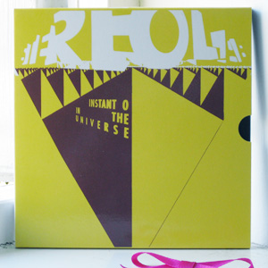
Ah, look at that cover artwork – fantastic. Fine, fine work by House@Intro, the inspirational force behind all manner of great-looking records. House is graphic designer Julian House, and Intro is the The Intro Partnership, who I’d give several right arms to work for. Even if their website is completely Flash-based, which always narks me.
Loooove the Stereolab typography on the front of this three record set. It’s astounding. Masterful use of positive and negative space to eke the letterforms out of nothing, with all kind of subtle spatial reversals going on. It’s the kind of thing that looks straightforward but that is in fact a mutha to do well. This is a nice little package in general – the weight and bulk of three seven inch singles popped into a little slipcase that gives the whole thing a feel of a mini-epic; a nod to expensive and luscious multi-album box sets rendered at a small scale.
Just one gripe: the sleeves inside which each of the records is housed are printed with a solid shiny black tone, and it’s impossible not to cover them in fingerprints unless one approaches them as one might approach an original Gutenberg bible. Oh, House@Intro, why did you fail us with this one aspect of your work?