The concept of ‘perfect pop’ is a long-standing one amongst indie kids. It’s a term often thrown back at critics of songs, almost a defense mechanism: ‘yes, it’s very badly-recorded, but it’s perfect pop!’, ‘I know it’s Girls Aloud, and they’re completely manufactured, but it’s just a perfect pop song!’, and so forth. It’s a term used often in the hand-crayoned, hairslide-heavy realm of indie-pop, and there are a few bands – mostly from the early 1980s – who are pulled out as the big guns of perfect pop; the bands that created the framework for much that followed. Everything But The Girl are one of these bands, along with many others like Orange Juice, Haircut 100 and Aztec Camera. None of these are/were thunderingly independent or fiercely different, as one might expect – and so it’s surprising that ‘perfect pop’ is so often a term used in the context of independent music ideals. Perhaps it a question of scale – pop includes all manner of dross that clogs up the charts, but perfect pop represents a strain of that larger selection which ticks boxes for people who enjoy it alongside ever wider echoes of independently-released records.
For the record, in my opinion ‘I Don’t Want To Talk About It’ isn’t perfect pop. I find it somewhat boring and dreary. However, Everything But The Girl have a selection of contenders in their long history for the perfect pop epithet.
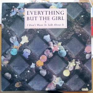
On the back of this record’s sleeve, within some oddly-precise liner notes, it states that ‘The cover photograph of discarded confetti is by Richard Haughton’. Some points that this raises in my mind:
- Why the need to tell us what the photograph is of? Shouldn’t it be obvious from, well, looking at the photograph? Or is somebody concerned that it’s not obvious what it’s of? In that case, why was it used?
- The photograph is actually pretty poor – it’s been blown up to the point where it’s quite blurred and the colours are dulled. More than that, it’s just not that interesting an image.
- If this is the same Richard Haughton, he’s snapped some pretty big names! Paul McCartney, Simon Le Bon, New Order… even Phil Collins. His website’s homepage is very odd, though. If you’re on a big monitor and you increase your browser window size so that it’s larger than the image on the homepage, you’ll see that there’s a copy of that image behind the main one, and that the copy scales to fit the browser window. I don’t know why the main image itself doesn’t scale. This kind of thing bugs me.
Some randomly-selected ‘perfect pop’ links from a Google search:
- Popcorn vending machines from Perfect Pop
- Norwegian record label, Perfect Pop
- A blog that offers what the name suggests: Perfect Pop Songs
- The Guardian on how the Pet Shop Boys created a perfect pop song.