This is the first Ex-Easter Island Head record I’ve owned, after listening to their earlier work Mallet Guitars One and Mallet Guitars Two / Music For Moai Hava on Spotify several hundred times. It seemed like I should do my small part to help prevent the collapse of the music industry, and shell out for an actual record.
(For the record – no pun intended – I think Spotify is one of the greatest advances for the internet and the music industry of recent times. Perhaps at least a tiny amount of money per play going to a label is better than nothing at all, right? Although I’m not sure why they haven’t yet made it possible to buy physical products/’premium’ editions of streaming albums through their service, in the same way that Bandcamp have. Surely that’d be great, no?)
Anyway, in brief; Ex-Easter Island Head describe themselves as “A Liverpool, UK-based ensemble composing and performing music for solid-body electric guitar, percussion and other instruments.” What this means is chiming, uplifting guitar sounds that are carefully melodically arranged to reveal the spaces in between notes to the listener – resulting in beautiful, disconcerting music that often sounds like human voices in a ghostly, gamelan-like set of floating aural shapes. Over the four movements of Mallet Guitars Three – yep, these guys do movements, not songs – I’m enveloped in a kind of upper atmospheric stasis; an austere yet warm place to be that takes a darker turn by the time of the gliding, descending notes of the fourth movement. It’s excellent stuff, and the varied used of subtle, chugging rhythm binds the sound to a structure that prevents it floating away.
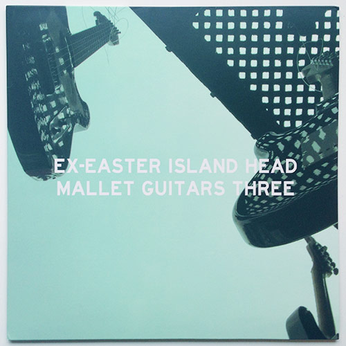
The front cover shows an apt duotone photograph of guitars seemingly levitating in a mysterious space, and the back keeps things simple with credits, a publishing/copyright statement and nothing more. The simplicity and starkness is interrupted by two factors:
- Unless my eyes deceive me, there is a very subtle repetition of the front cover’s top right grid structure across the back cover, printed almost as black on black.
- On a more functional level, there is more space between the ‘published’ p-in-a-circle character and the year 2013 than there is between the copyright character and its own year. I presume that this is an accident rather than by design. Side note: many fonts’ character sets don’t include that p-in-a-circle character, which can make record sleeve design a tiny bit more frustrating than it needs to be, as the designer has to create their own in a way that matches the © for that font as closely as possible.
Links: Ex-Easter Island Head / Low Point